
RETHINKING INVESTMENT ANALYSIS DASHBOARDS
Designing for Constraints
Overview
Role: Lead Product Designer
Team: Product Manager • Engineering • Product Experts
Timeline: 4 months
Scope: Improving analysis dashboards (“workspaces”) within Front Office Solutions
Users: Majority of institutional clients using the platform
Impact: Multiple improvements shipped; dashboard template concept adopted into roadmap
Index
Context
Key Challenges
Prioritizing Improvements
Designing Within Technical Constraints
Reintroducing Lightweight research
Reframing the Problem: Dashboard Templates
Outcome
Context
Front Office Solutions includes three major areas:
Investment research
Operational workflows
Analysis tools
The analysis dashboards (“workspaces”) serve as the primary entry point to Front Office Solutions and are used by the majority of institutional clients to assemble portfolio analytics from different parts of the product, monitor performance, and identify investment risks.
Over time, new analysis features were added but existing dashboards were not consistently updated, leading to usability issues.
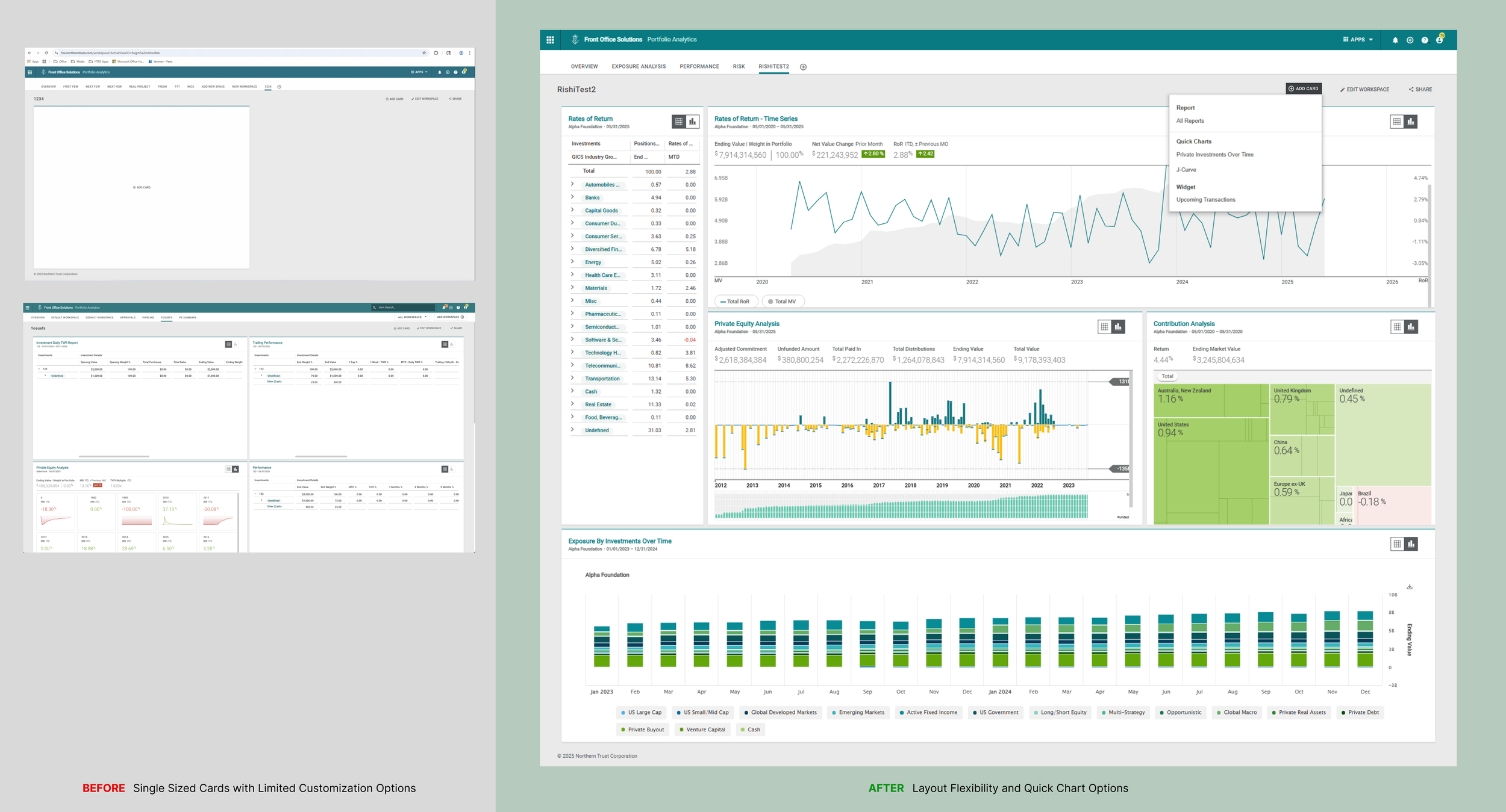
As part of the enhancements to the web workspaces users have more flexibility with layout and can get quick insights with Quick Charts.
Key Challenges
This project required balancing several constraints:
An upcoming client advisory meeting
Technical limitations of the React component library
Hesitation from product teams to engage in research
Limited time to deliver meaningful improvements
Prioritizing Improvements
During kickoff workshops, we mapped dashboard issues using a pain vs. effort matrix.
This allowed the team to prioritize improvements with the highest user impact.
Three key areas emerged:
Card resizing
Dashboard settings
Quick insights
Designing Within Technical Constraints
Engineering input early in the process helped refine the scope of several features.
Card Resizing
Initial designs offered flexible layout adjustments based on competitive analysis.
However, the React library supporting the dashboard imposed limitations.
The final design relied on built-in layout behaviors to ensure faster implementation.
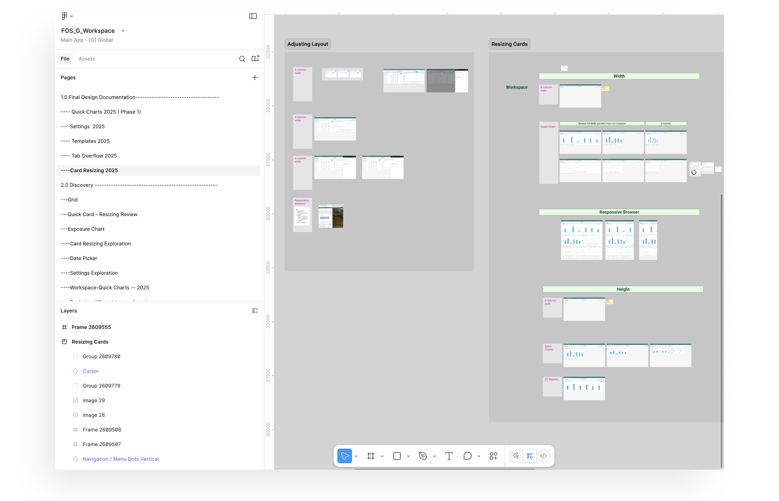
Articulating the rules that govern card behavior and layout, taking into account the available default options from the React Library.
Card Settings
Initial designs allowed editing card settings directly within the dashboard.
Due to backend constraints, the feature was implemented first for new quick chart cards, allowing the pattern to be more easily adopted in future releases for legacy cards.
Quick Insights
Users often needed quick insights without building full reports.
The initial designs explored a library of quick analysis charts that could be added directly to dashboards.
Due to timeline constraints, two initial charts were released with the architecture supporting future expansion.
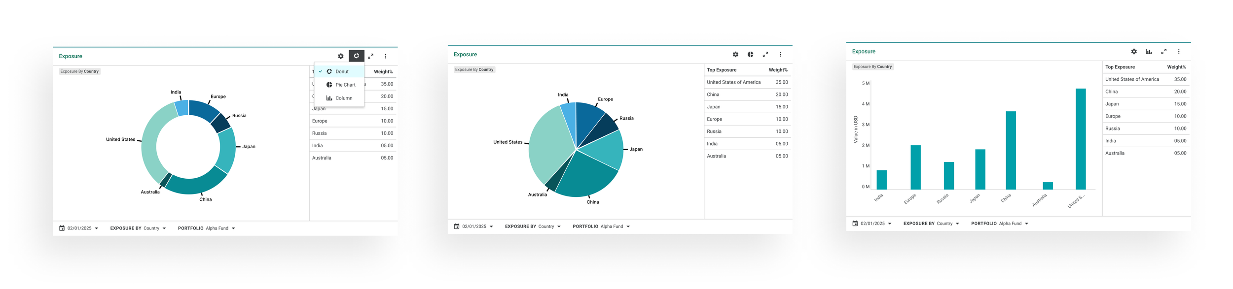
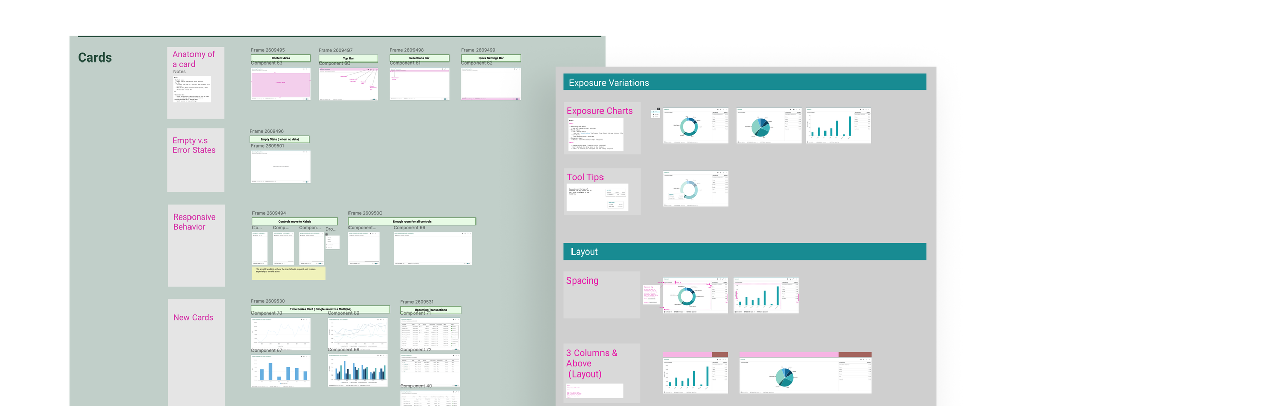
After defining the overall card logic and behavior, I started designing for different types of cards, such exposure quick chart above.
Reintroducing Lightweight Research
The product team initially hesitated to conduct research due to concerns about delays.
To address this, I introduced a two-part research approach.
Build Then Test
For some interactions, testing was conducted after early implementation, ensuring feedback was grounded in realistic interactions.
Asynchronous Testing
Using a newly introduced testing platform, I collected feedback from eight internal users within one week.
Product managers found the recorded sessions especially useful for validating decisions.
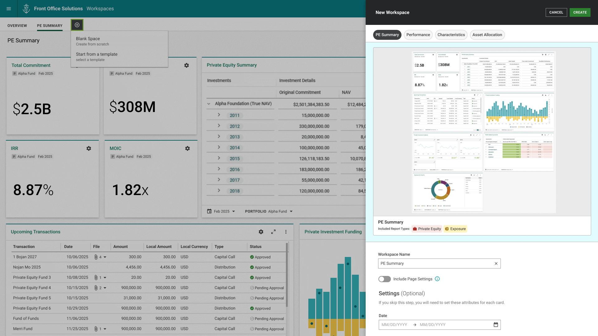
Reframing the Problem: Dashboard Templates
User testing confirmed that while individual improvements were helpful, the overall dashboard experience still lacked clarity.
With two weeks remaining before the advisory meeting, we reframed the problem.
Instead of continuing incremental improvements, we introduced the concept of dashboard templates.
Templates provided:
Pre-configured dashboards for common financial tasks
Optimized layouts for different card types
Bulk editing during dashboard creation
A prototype of the template concept was presented at the client advisory meeting alongside the implemented improvements and received strong positive feedback.
Outcome
Several improvements to the analysis dashboards were released to production and made available to the majority of institutional clients using Front Office Solutions.
Key improvements included:
The ability to resize dashboard cards, providing more flexibility when organizing analyses
Quick chart cards that allow users to surface portfolio insights without creating full reports
In-dashboard settings for newly introduced cards, reducing the need to navigate away from the workspace
Although some features required compromises due to technical and timeline constraints, the overall redesign improved the usability and flexibility of the workspace experience.
User feedback during internal testing and after release confirmed that the new interactions made it easier to quickly assess portfolio information and customize dashboards to individual workflows.
In addition, the dashboard template concept presented at the client advisory meeting received positive feedback and helped shape the product roadmap, establishing a direction for future improvements to the workspace experience.