
IMPROVING VALUATION WORKFLOWS FOR INSTITUTIONAL ASSET MANAGEMENT
Simplifying a complex workflow
Overview
Role: Lead Product Designer
Team: 1 Product Manager • Engineering Team • Product Experts
Timeline: 3 months
Scope: Migration of legacy valuation workflow from desktop to web
Users: Investment operations teams and institutional clients worldwide
Impact: Shipped to production and used by hundreds of users globally
Index
The Problem
Discovery
Design Decision: Simplifying Statuses
Designing the Grid Interaction
Validation Through User Testing
Iteration: Improving Calculation Visibility
Adapting to Engineering Constraints
Outcome
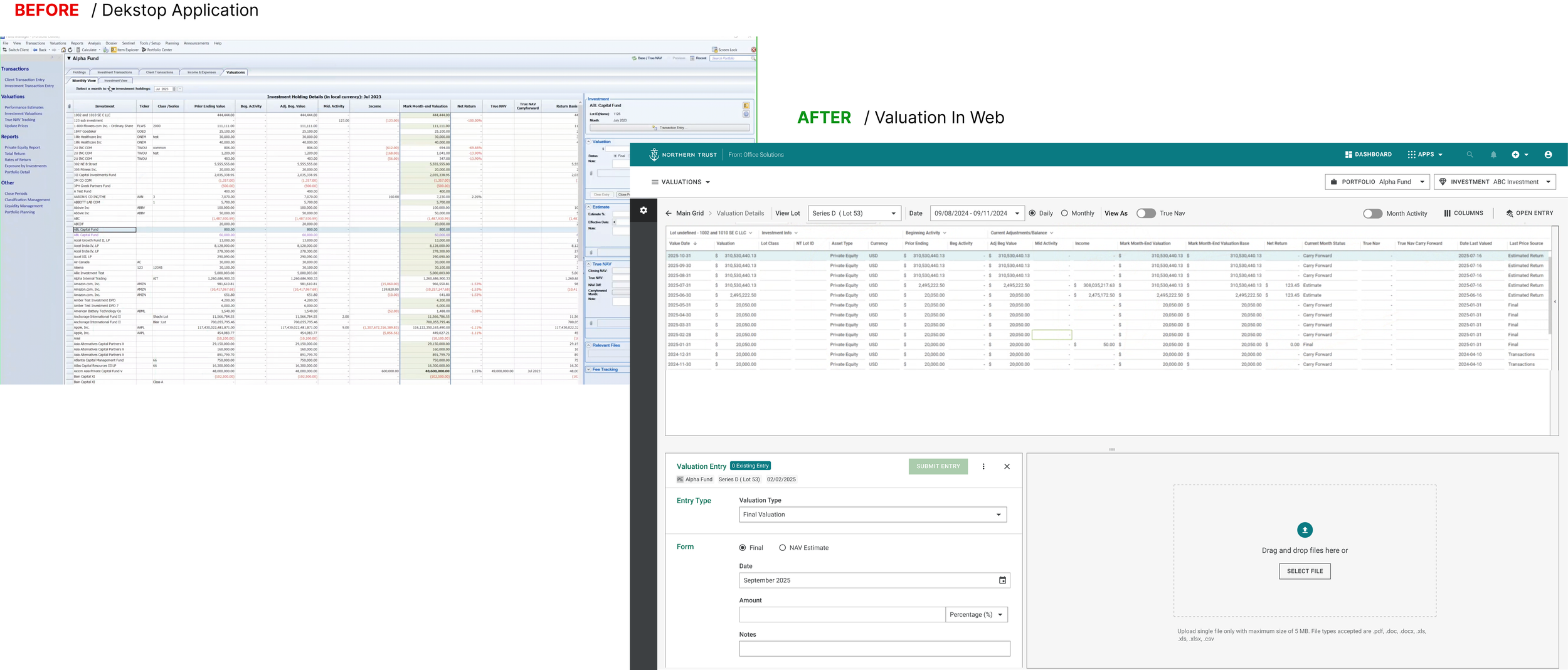
The Problem
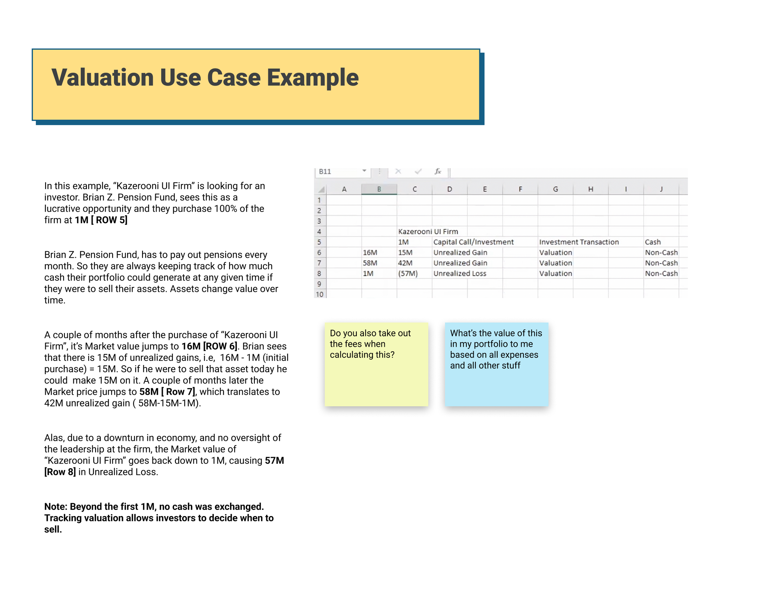
Private investment valuation is a hands-on operational process performed periodically by investment operations teams.
In the legacy desktop tool, users struggled to understand the status of a valuation, because the information was scattered across multiple columns in a dense grid.
Users often had to manually piece together signals across the interface to determine:
Whether a valuation was pending
How it was generated
What actions were required
Previous research had shown that new or infrequent users struggled most with this workflow, particularly external clients reviewing valuations.
Discovery
To understand the workflow, I facilitated a series of workshops with:
The Product Manager
Two client domain experts
Together we mapped the valuation lifecycle and refined requirements for the web migration.
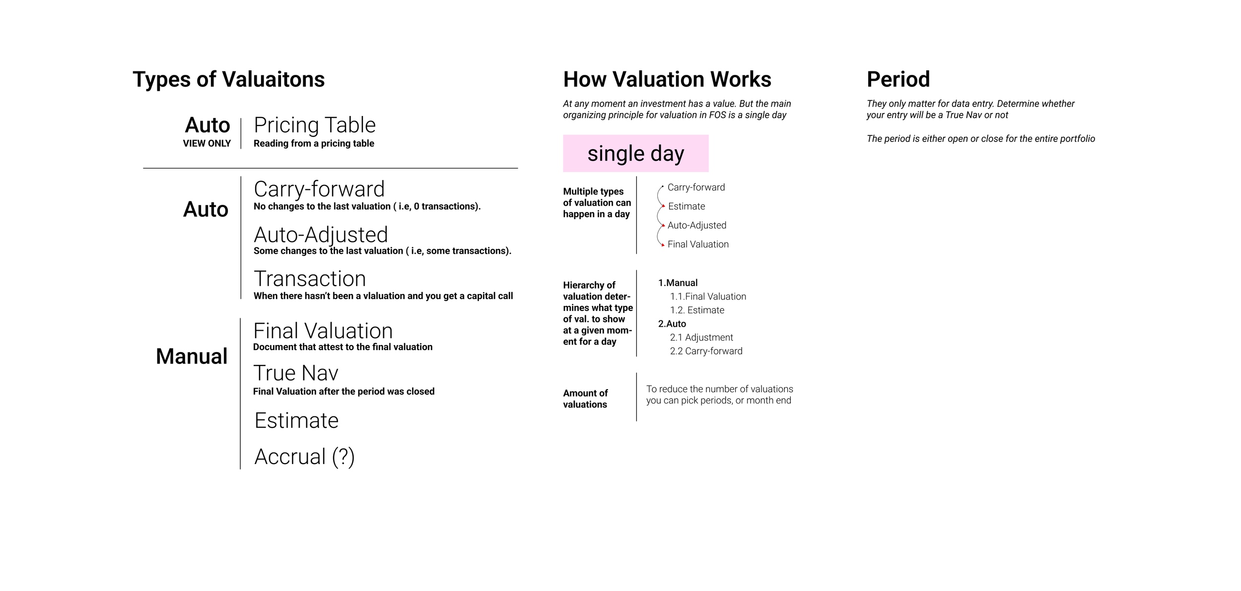
Through this process we identified eight distinct valuation statuses used internally at Northern Trust.
However, expecting users to interpret eight internal states created unnecessary cognitive load.
Interviewing my PM and Product Experts to understand Use Cases
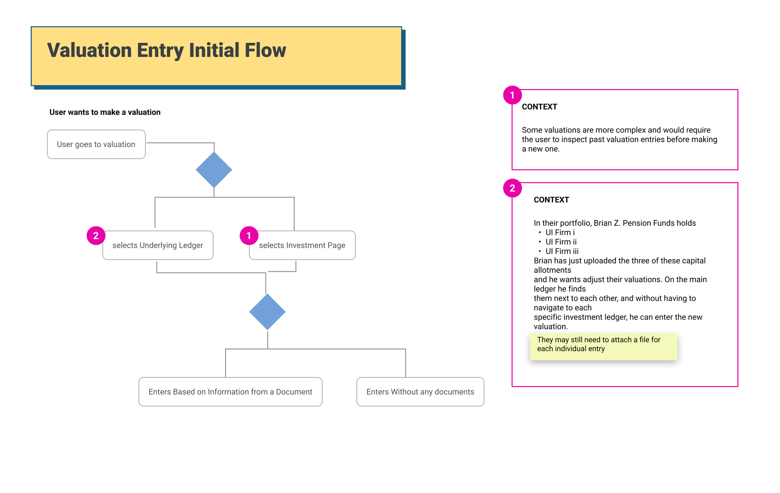
Collecting Interaction flows
Design Decision: Simplifying Statuses
To make statuses easier to understand, I proposed grouping them into three conceptual categories:
Manual valuations
Auto-generated valuations
Pricing Table
Manual valuations were operationally the most critical, so the interface emphasized these states.
This categorization allowed the interface to reveal valuation progress clearly without requiring users to understand internal terminology.
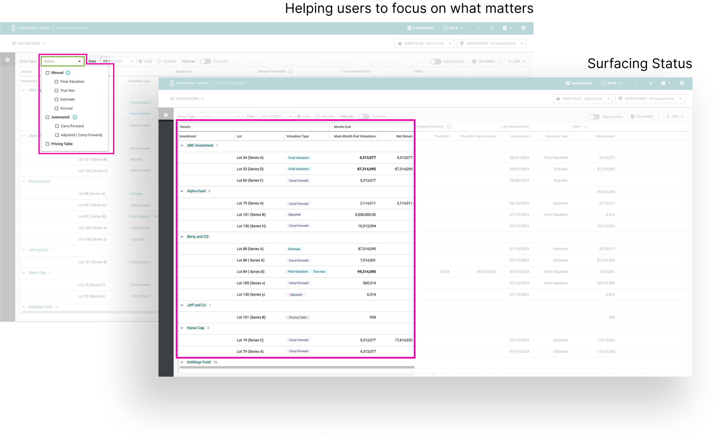
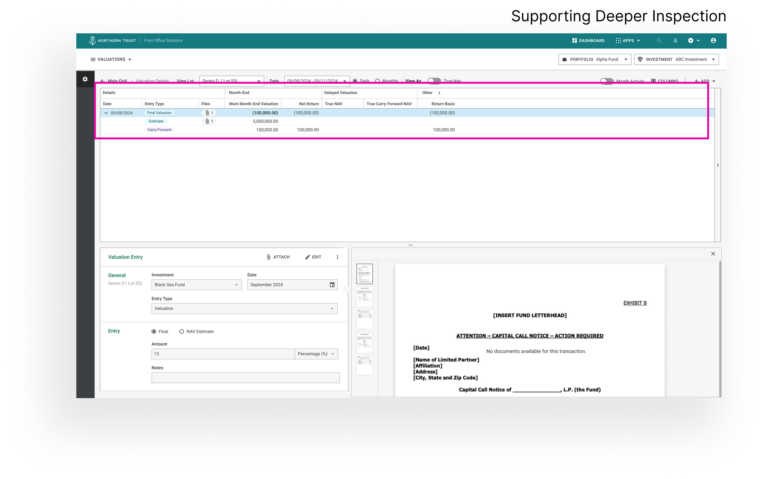
Designing the Grid Interaction
The valuation grid is the primary interface for monitoring investment valuations.
Key design decisions included:
Surfacing status clearly
A dedicated valuation status column made progress visible without requiring users to interpret multiple signals.
Helping users focus on what matters
Filtering options allowed users to quickly isolate investments requiring attention.
Supporting deeper inspection
Users could drill into valuation history and see how statuses evolved over time.
Validation Through User Testing
I tested early designs with:
3 internal users
2 client account managers
Participants reported significantly improved clarity when tracking valuation progress.
However, testing revealed an important adjustment.
Users strongly preferred seeing all columns by default, rather than hiding non-status information.
The design was updated accordingly while maintaining filtering capabilities.
Iteration: Improving Calculation Visibility
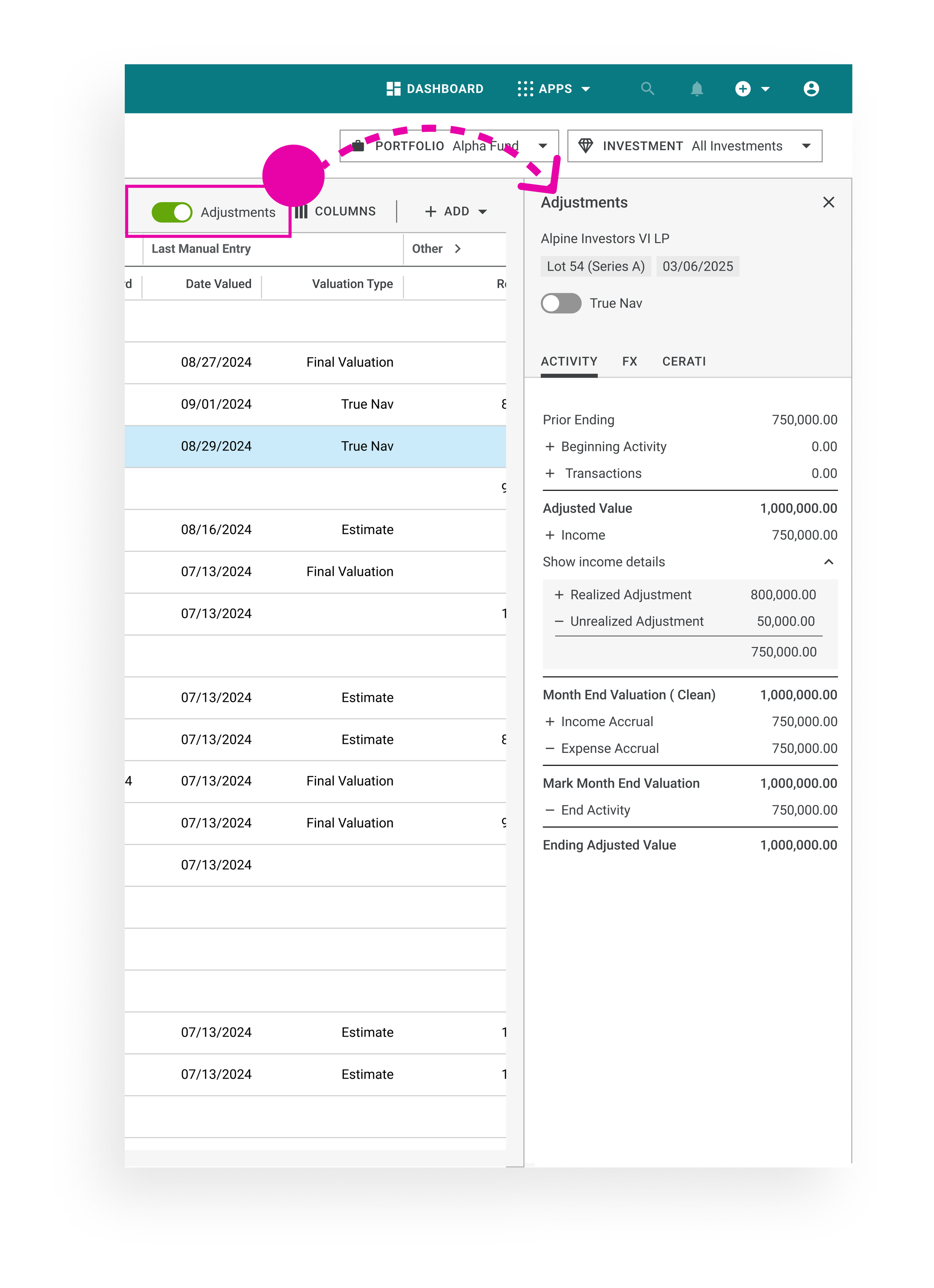
Another issue surfaced during testing.
Users often needed to verify valuation calculations by scanning horizontally across many columns.
Instead of collapsing grid sections, I introduced a calculation panel that displayed valuation metrics vertically, similar to a spreadsheet.
The panel also surfaced transactions that influenced the valuation.
This design significantly improved readability and was well received after release.
Adapting to Engineering Constraints
During implementation, engineering identified a technical limitation preventing drill-down interactions from working as originally designed.
To keep the release on schedule, I proposed two alternative interaction patterns using existing platform patterns.
This allowed the product and engineering teams to select a solution that balanced usability and implementation constraints.
Outcome
The redesigned workflow shipped as part of the web migration and is now used by hundreds of users globally.
Key improvements included:
clearer visibility into valuation status
reduced effort required to interpret operational states
improved readability of valuation calculations