
IMPROVING MONEY MOVEMENT WORKFLOWS FOR LARGE INSTITUTIONS
From research to design
My Role: Design Strategy | Research | Requirement Gathering | Interaction design|
2021 June - Present
Index
Introduction
Product and Company
The company has been a wealth management company for more than a century, and over the years it has built dozens of online platforms to respond to the needs of its institutional clients. The initiative I was part of aimed to integrate and centralize these different platforms.
In my product, we dealt with institutional clients. These could range from a multi-national corporation to an actual country’s funds.
My Role
As a senior product designer, I worked on a suite of products that addressed money movement for cash and trade. For desktop, we were two designers, each owning different features of the desktop application; For mobile, I led the research and design, and was part of the initial product launch, and a subsequent major release.
I collaborated with my PMs and Product Experts on gathering requirements. I facilitated workshops and meetings to define research strategies for features in discovery and delivery stages. I also worked closely with engineers both before and after delivering the designs to ensure feasibility and proper implementation, all the while making the necessary adjustments as needed.
Finally, the company had a number of specialized departments such as Design System, Accessibility, Data Analytics, User Research, etc, and I was able to draw on their expertise at different points of my projects.
Desktop - Discovery
Overview
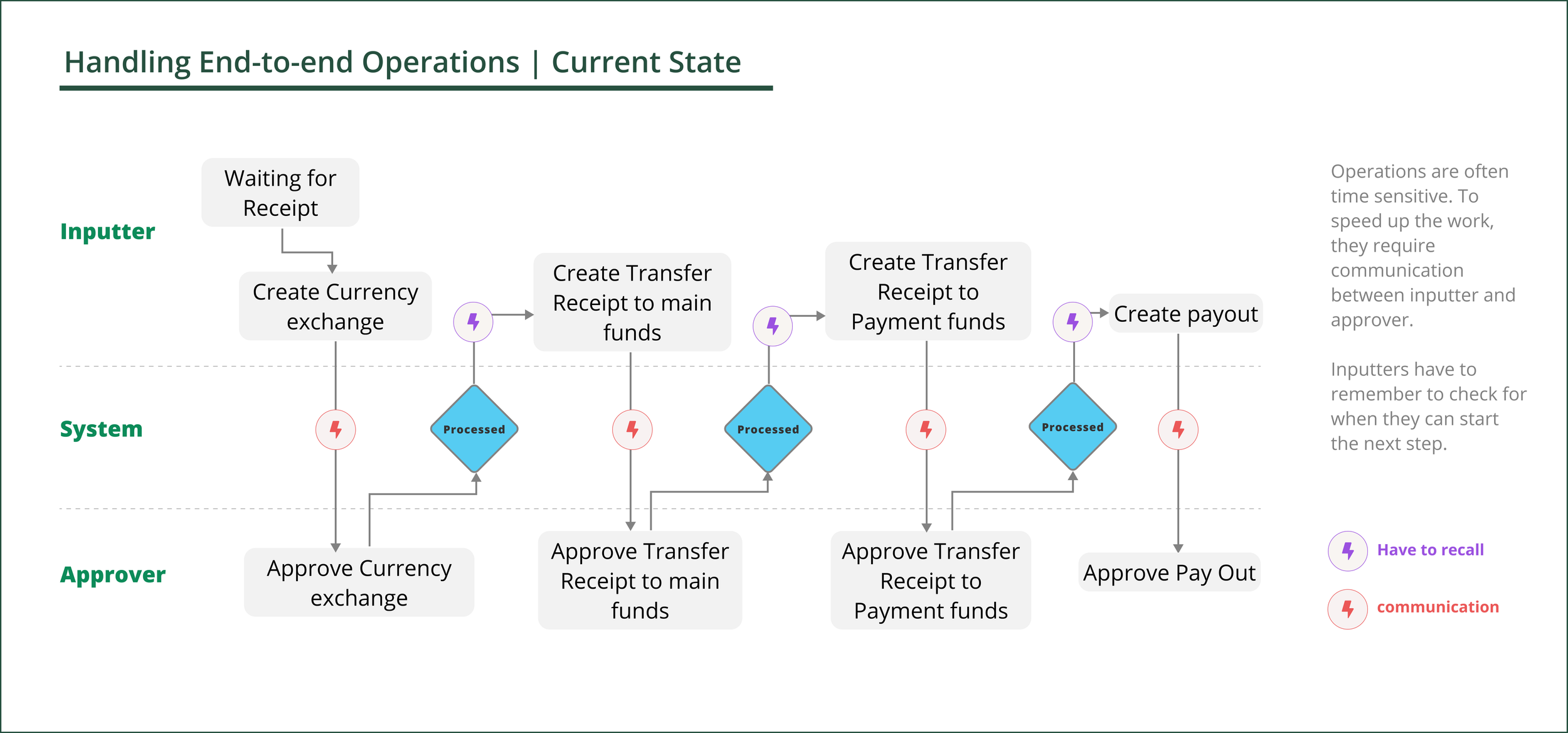
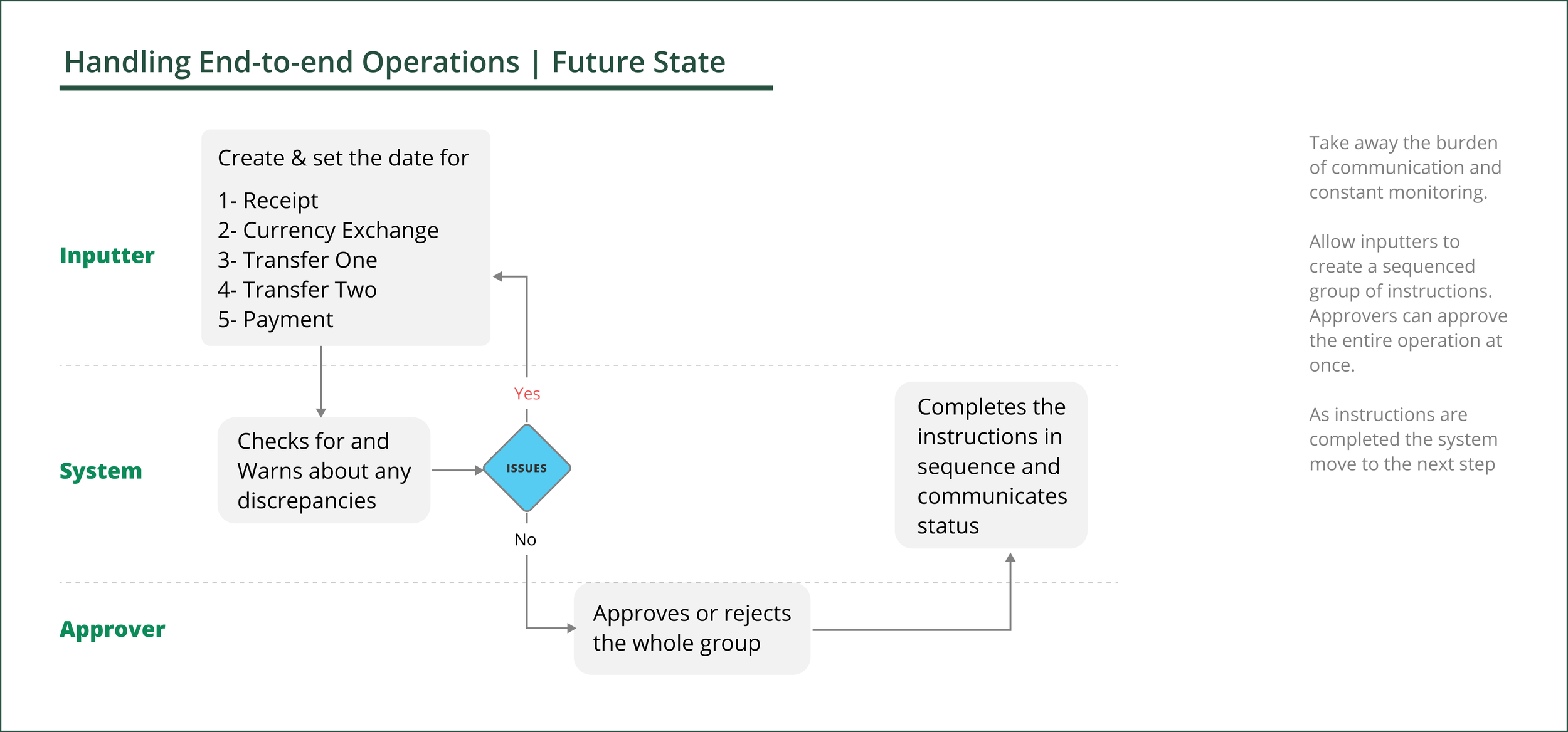
In this case study, I will be focusing on an end-to-end flow during the Northstar discovery. The Northstar work stream was about designing the end state of the platform and from there break down the designs into implementable phases.
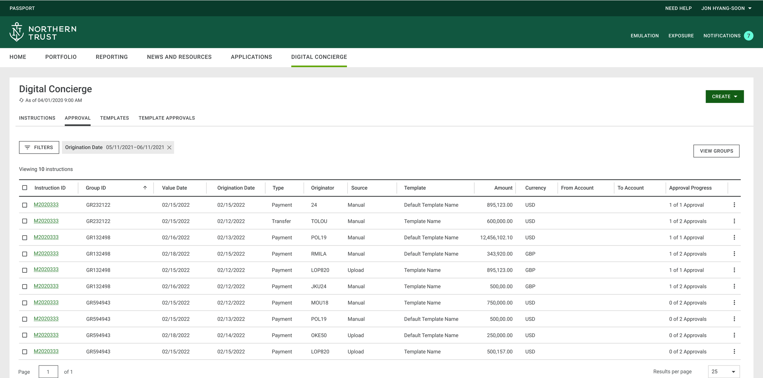
User: Fred works in a team of five. He has to process high volumes of instructions every day. Different operations ( e.g., pay account manager fees) may require a sequence of different instructions( i.e. transfer to a new account, then pay, etc.), with different team members involved at each stage.
Problem: Today, Fred’s team has to keep track of the completion of a business operation by tracing individual instructions across different platforms. Eventually, all instructions will be part of the centralized platform.
Opportunity: How might we allow users to easily handle an entire business operation?
Process
Ideation
During our first round of ideation with the PMs and Product Experts, we landed on the idea of grouping instructions. So that if instructions are grouped at the time of creation, then whoever is approving, can review and approve the whole operation with one click.
Concern: Some experts were worried that by taking on the sequencing of instructions within a group, and giving the ability to approve the whole operation with one click, we would be introducing too much technical complexity.
Validation and reframing
Given the concerns around his feature, I wanted to get some user reactions to the concept itself. So, I included the idea of one-click-approval for a group at the end of a user study I was conducting for mobile. Overall, it generated positive feedback among the participants. Some of them pointed to the pitfalls of one-click approval for a group.
A key learning from the study was that users cared to see related instructions ( with or without one-click approval), because it could help them with reporting and daily management of instructions.
Sizing the Interest
After the positive responses from the study, I worked with the analytics team to use embedded surveys to do a round of quantitative study.
We learned that the feature would be most helpful to clients with higher volumes of instructions to process.
Scoping through user interviews
The team wanted to know what solution to go after in the short term to give visibility to end-to-end operations. For that I set up a round of interviews where participants could compare the different solutions for handling different operations
1- A list of all instructions in one place, without any indication of what’s related ( for a lot of clients who currently manage instructions on different platform, that in itself would be something new)
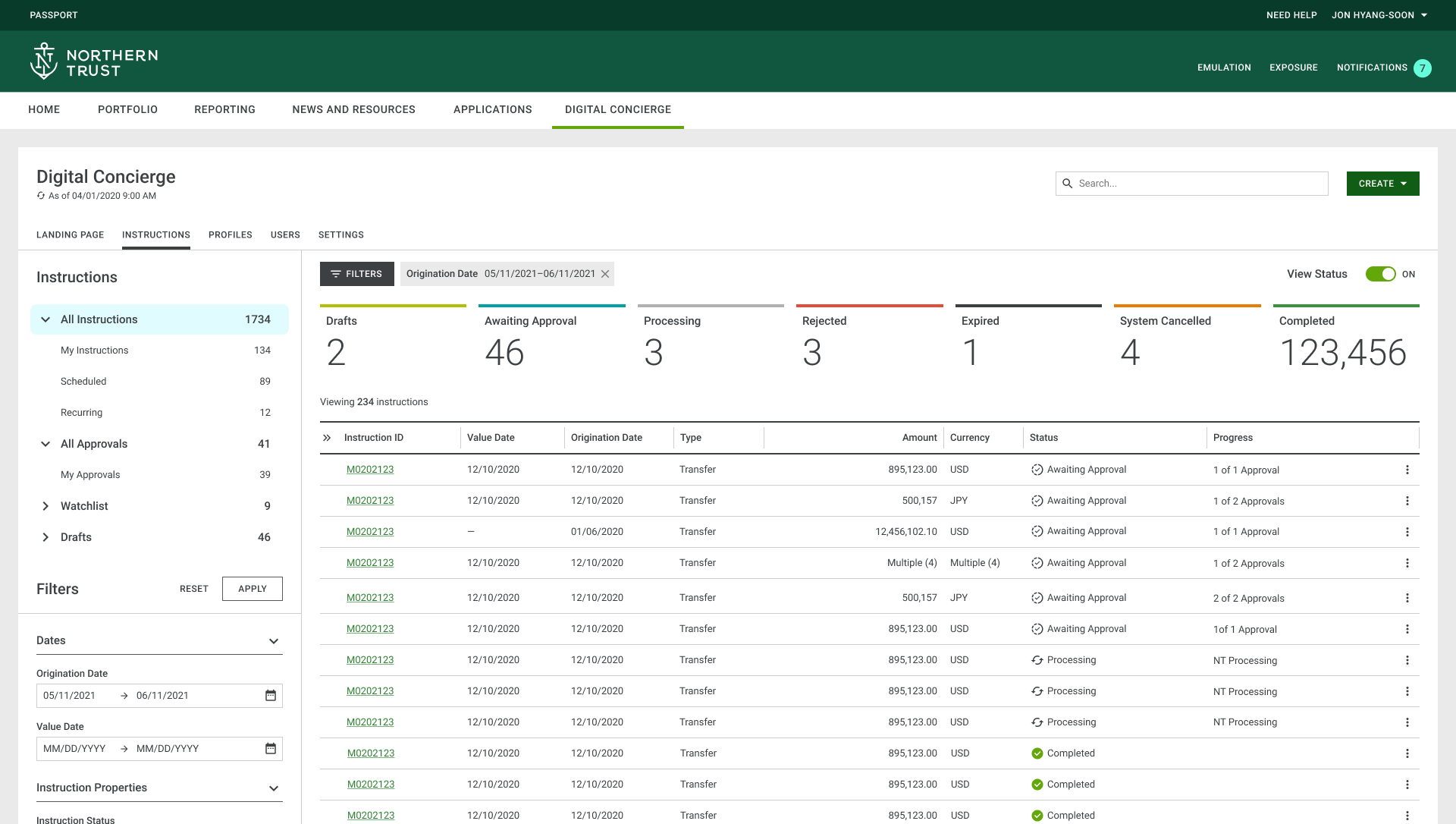
All instructions are shown within the same platform
2- Showing what instructions are related on the list view.
Sorting by group will show all the instructions that belong within the same group.
3- A grouped instruction that deals with the sequence of instructions within an operation.
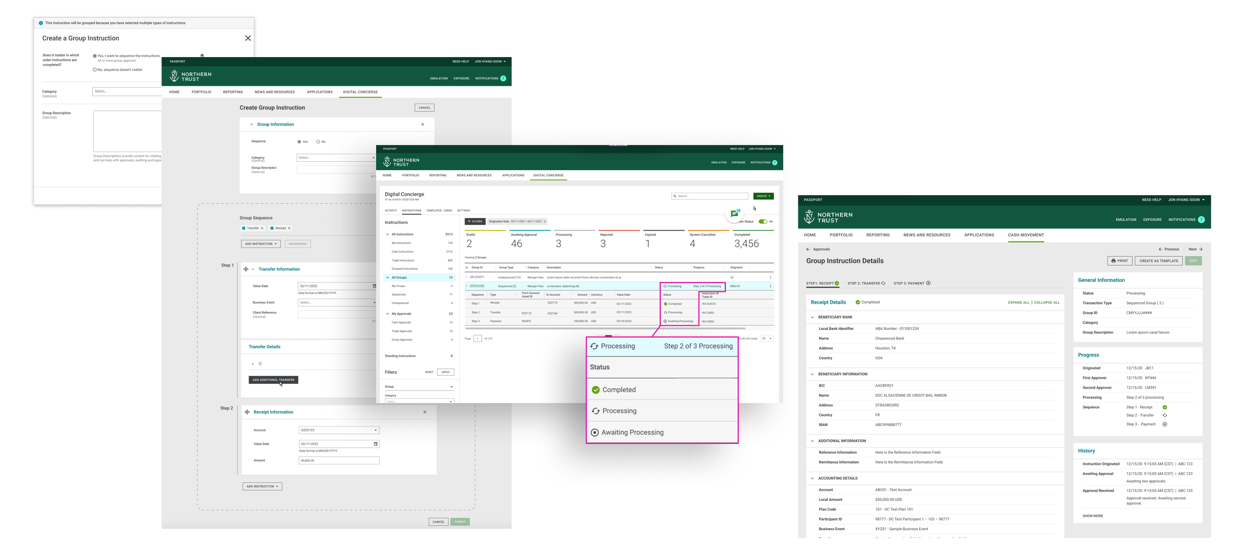
A Grouped Instruction would be a new type of instruction that is created and approved as a group.
We learned that even though participants were excited about having a centralized view of all of their instructions, they didn’t think that it would be efficient enough for monitoring end-to-end operations. All participants found it useful to be able to tell what instructions are related. Some participants had reservations about sequencing groups, due to their internal workflows and regulations.
Outcome
After reviewing the findings, the product team started exploring the possibility of including a feature that would allow users to tell related instructions in the 2023 roadmap.
Mobile - Delivery
Overview
In this case study, I will be focusing on interaction design, and how I collaborated with the team to make necessary enhancements based on user feedback and best practices.
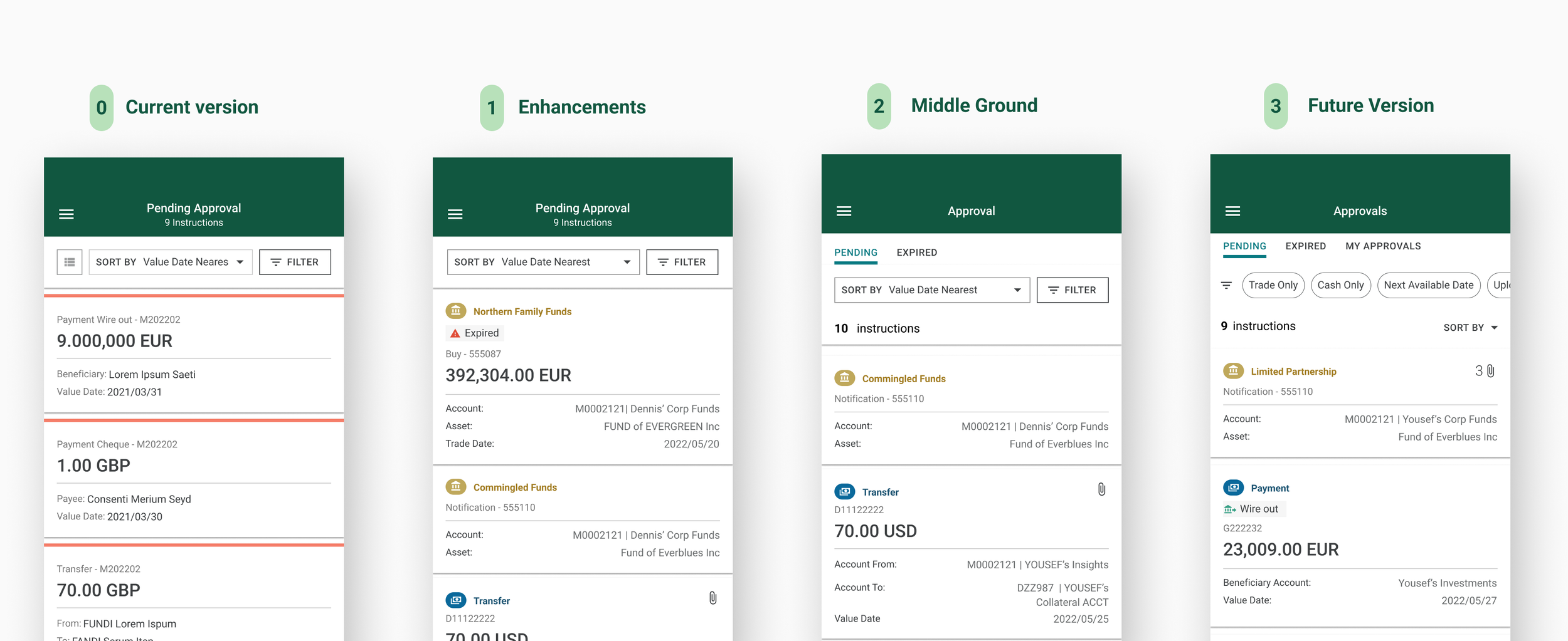
User: Judy is an approver. She has to process high volumes of instructions. She has poor eye-sight. She relies on the mobile app, when away from her computer.
Problem: Currently the list view isn’t easily scannable, and certain elements don’t meet the accessibility requirements.
Opportunity: How might we enhance the list view to make it scannable and accessible.
Process
Discovery: I first had several meetings with stakeholders to understand what types of content the list view needs to accommodate based on different types of instructions.
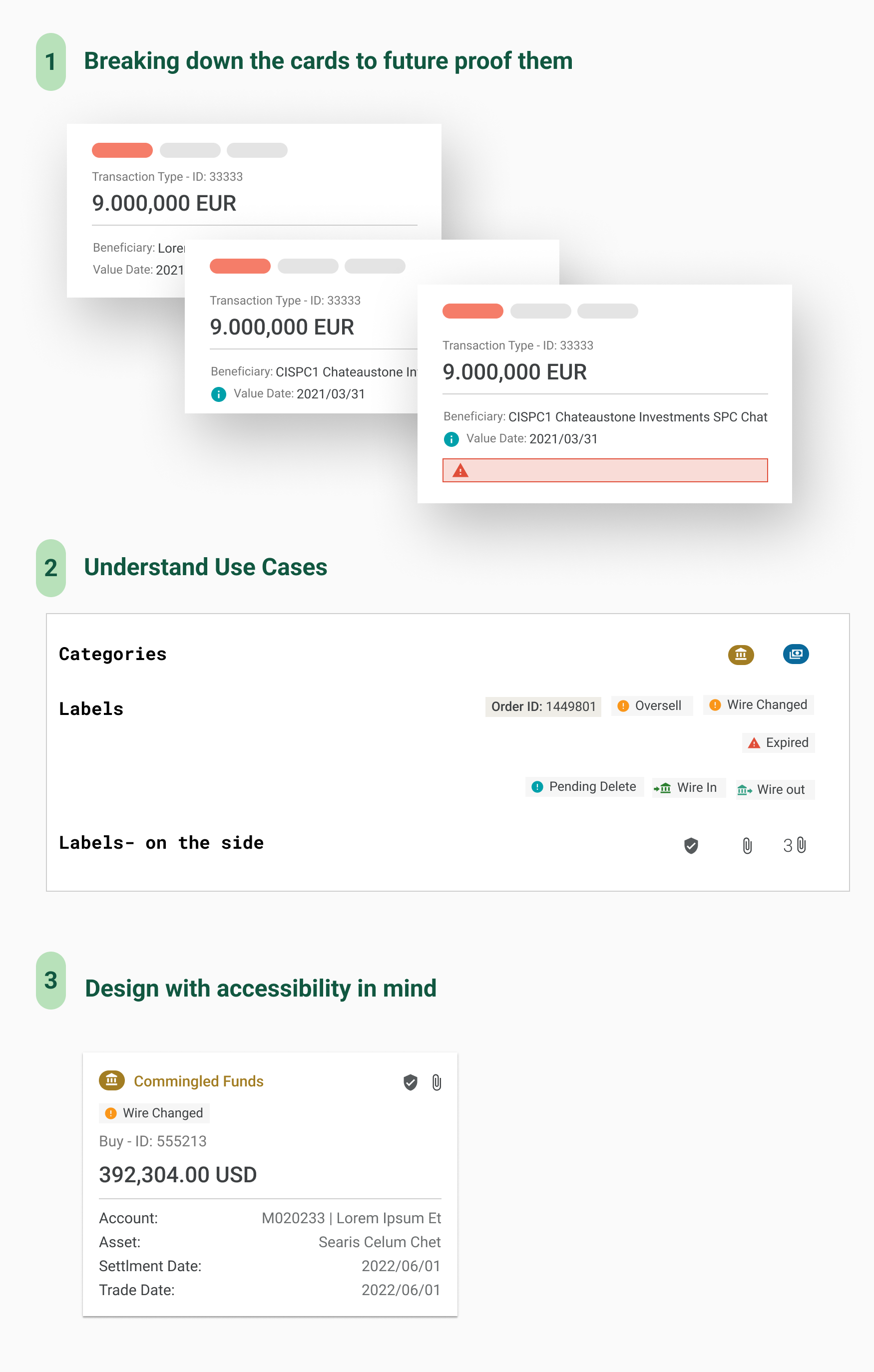
Then, I reviewed the results of the last round of usability studies. Then, I did a round of heuristic analysis. Some of the results were that the font was too small and not accessible. The list wasn’t easily scannable. The cards hold a lot of information. etc.
Iterations and testing: There were a couple of rounds of iterations, done in collaboration with PMs and Tech team. It was important to bubbling up crucial information to the top to allow users to decide what instructions to address first.
I was able to conduct a major usability study with the actual users to assess our assumptions and test the designs.
Addressing Accessibility: Making the app accessible was key, because a lot of our users were older. Apply accessibility meant close collaboration with the Design Systems Team, and the Accessibility Team to ensure that the components are properly designed and implemented.
Outcome
After testing the designs and incorporating user feedback, we broke down the implementation into phases. In November the team launched its second major release.
